Display Options dialog box
The Display Options dialog box is accessed via the Options tool of the Annotations groups on the Select tab. The controls of the Display Options dialog allow you to change the appearance of selected annotations and ROIs in your image. This topic provides descriptions for the controls on the following panels of the Display Options dialog box:
Border
The controls in the Border group allow you to configure the visibility
and display properties of ROI and annotation lines. When
the Border group appears on the Ellipse/Rectangle, Rounded Rectangle, or Line/Polyline
tab, it allows you to configure the display properties of the bounding
lines of the selected ROI or annotation object. When
the Border group appears on the Label
tab, it configures the bounding box around the label.
Visible: Check/uncheck this box to show/hide the border.
Color: Specifies the color to use for the border.
Width: Specifies the width, in points, to be used for the border.
Style: Specifies the line style to be used for the border.
Fill
The controls in the Fill group allow you to define the visibility and
color fill properties of closed annotation and ROI objects, such as rectangles
and circles. When
the Fill group appears on the Label
tab, it configures the color fill properties of the box around the label.
Visible: Check/uncheck this box to show/hide the color fill. If unchecked, the inside of the shape will be fully transparent.
Color: Specifies the color to use for the fill.
Options
The controls in the Options group allow you to set miscellaneous display
options and to save the current configuration as the default. When
the Options group appears on the Label
tab, it configures the display properties of the box around the label.
Zoom with Image: If checked, zoom operations applied to the image will also be applied to the annotation or ROI object. If unchecked, zoom operations will be applied to the image but not to the annotation or ROI object. A special cross mark appears in the handle of the object's bounding rectangle representing the point where the object is anchored in the image.
Opacity: This control allows you to configure how transparent the annotation or ROI object is. Moving the slider left makes the annotation or ROI object more transparent; moving the slider to the right makes the annotation or ROI object more opaque.
Layer: By default, all objects are added to "Layer 0"; you can, however, assign objects to any of the other nine available layers. All objects in a layer are displayed together, before (under) or after (on top of) all objects in other layers. By default objects in Layer 0 are displayed first (under all others), while objects in Layer 9 are displayed last (on top of all others). This pull-down list box shows the names of the ten layers. If all selected objects are in the same layer, then that layer is shown grayed and checked. Clicking on a layer name, moves the selected annotation/ROI object(s) into that layer.
Save as Template: Click on this button to make the current set of annotation/ROI properties the default. These properties will be applied to subsequently added objects of the same type.
Text
The controls in the Text group on the Labels and Text tabs allow you to enter in the text for the annotation/ROI label and define its font, font size, color, and format properties.
Position
The controls in the Position group on the Labels
tab allow you to position the annotation/ROI text within the bounding box.
Position: Positions the label relative to the annotation/ROI that you are labeling. You can place the label inside the annotation/ROI (select "Center") or at a corner outside the object (bottom-left, bottom-right, top-left, or top-right). Once positioned, you can use the Offset by X and Offset by Y options to move the label to locations between the position points.
Offset by X: Use this spin box to move the label left and right. A positive number moves the label that many pixels right. A negative number moves the label that many pixels left.
Offset by Y: Use this spin box to move the label down and up. A positive number moves the label that many pixels down. A negative number moves the label that many pixels up.
Shape (Point)
This group only appears if a Line or Polyline is selected. Use the controls in the Shape group to configure the display properties of line and polyline-type annotations/ROIs.
Start/End: For the Line and Polyline pages only, these drop-down lists each contain the same list of common shapes to specify the line ends, including plain, diamond, arrow-head, etc.
Color: Specifies the color to use for the fill.
Width: This control allows you to specify the line width, which can range from 1 to 99 pixels.
Style: This drop-down list box allows you to select the line style from common styles such as solid, dotted, dashed, etc. The drop-down menu for the point tool displays a wide variety of point styles. You can use your mouse wheel to adjust the size of your annotations.
Shape (Line/Polyline)
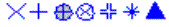
The options in group apply only to the point-type annotations. The options in the pull-down list box allow you to select the shape to use as the point marker. The basic shapes include the single-pixel point (which is rarely selected as it is hard to see), X, cross, cross within circle, and X within circle, and so on. Some of the many available symbols are shown below:
Color: Specifies the color to use for the point marker.
Width: Specifies the width, in pixels, to use for the lines of the point marker.
Style: Specifies the line style to be used for the border of the label text bounding box.
Roundness
This group only appears if a rounded rectangle annotation/ROI is selected. The options in this group allow you to control how rounded the corners of a rounded rectangle are. In the Width spin box, enter the pixel width to use for rounding. In the Height spin box, enter the pixel height to use for rounding.
Note: The roundness value is expressed in 1/2-pixel increments. For example, the rounded rectangle below has Width and Height values of 200 pixels.
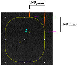
Note that you can also click and drag the yellow point (labeled "A" in the example above) to define the roundness settings.